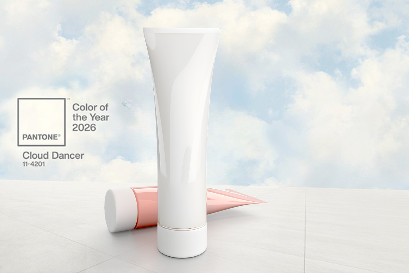
The announcement of the Pantone Color of the Year 2026 once again brings global attention to the role of color as a cultural and commercial signal. While often framed as a creative or aesthetic choice, the Color of the Year has implications that go well beyond mood boards and design studios. For the packaging industry, it represents a reference point that can influence branding strategies, material choices and production decisions across the value chain.
In an increasingly competitive and sustainability-driven market, color is no longer a purely visual element. It is part of a broader system that connects consumer perception, industrial feasibility and environmental responsibility.
Why Pantone 2026 matters for packaging
Pantone’s annual color selection is widely adopted by brand owners as a shared visual language. In packaging, this translates into concrete decisions around new product launches, limited editions and packaging refresh projects. The Color of the Year often becomes a benchmark for aligning packaging with broader brand narratives and market trends.
For packaging professionals, the relevance lies in how a color trend cascades through the supply chain. Designers, converters, material suppliers and brand managers all need to interpret the same reference while adapting it to different substrates, formats and regulatory requirements. As a result, Pantone 2026 acts less as a stylistic prescription and more as a strategic input that informs planning and innovation.
From color trends to packaging strategy
Transforming a color trend into a viable packaging solution is a complex process. A color defined in abstract terms must be translated into physical materials such as paper and cardboard, plastics, aluminium or multilayer structures, each with its own technical constraints.
The perceived color can vary significantly depending on surface texture, finish, coating and lighting conditions. This makes testing and prototyping essential steps in the development phase. Close collaboration between brand owners and converters is often required to ensure consistency across different packaging components and production batches.
In this context, color becomes part of a broader packaging strategy, influencing decisions on finishes, printing technologies and even pack architecture, rather than being treated as an isolated design choice.
Challenges and opportunities for converters and brand owners
For converters, adopting trending colors like Pantone 2026 presents several challenges. Achieving uniformity, repeatability and long-term stability can be demanding, especially when working across multiple materials or high-volume production runs. Color management becomes critical to avoid deviations that could compromise brand identity.
At the same time, these challenges open up opportunities. Innovative ink formulations, advanced printing techniques and new surface treatments can help brands stand out on the shelf while maintaining technical reliability. For brand owners, the strategic use of a widely recognised color trend can strengthen visual storytelling and reinforce emotional connections with consumers, provided it is applied with consistency and purpose.
Sustainability and color: a complex equation
One of the most delicate aspects of color selection today is its relationship with sustainability. Certain pigments, coatings or printing processes may conflict with goals related to recyclability, material reduction or regulatory compliance, particularly in food and pharmaceutical packaging.
Aligning a trending color with eco-design principles often requires compromises and careful evaluation. The choice of inks, the number of layers used and the interaction between color and substrate all play a role in determining the environmental impact of the final pack. In this sense, color can become either a constraint or a lever for innovation, depending on how it is integrated into the overall packaging design.
Looking ahead
Pantone 2026 should be seen as a signal rather than a rule. For the packaging industry, its value lies in the questions it raises rather than in strict adherence to a specific shade. How can color trends be translated into scalable, compliant and sustainable packaging solutions? How can they support brand differentiation without adding unnecessary complexity?
As packaging continues to balance aesthetics, performance and responsibility, the Color of the Year remains a useful lens through which to observe how cultural trends intersect with industrial reality.